


.JPG)
Hi All! A new day is here with the dawning of a brand new president. This wonderful happening will bring change!! Similarly, the look of Artwark needs a change! While my logo, (above) is cute, an Ardvaark doing artwork, my line has become more high end, so I need a logo that relates better with my jewelry and is appealing to the eye. With your help and some brainstorming, I will be giving Artwark a makeover!!!
WHAT YOU GET: A very special prize!!! Retail value: $75
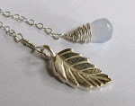
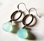
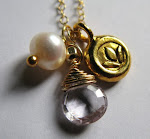
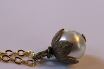
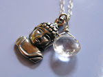
The winner will get a makeover bundle including High end products and an Artwark Necklace!!!~ Gold plated locket necklace with red poppy flower vintage cab and hand wired swarovski pearls. Shu Uemura Cosmetic Water, Avon Nail Polish in Baroque (tan/gold) Pumice stone, Bath & Body works verbena & lemon body splash and Avon big Stick Eye liner/shadow in lightening.
HOW: Check out my logo at the top of the page. Its cute, fun and quirky LOVE IT! However, I feel that my boutiques have grown up so to speak, the logo needs to as well. This contest has two parts. You must do both to win!
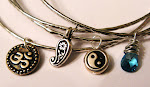
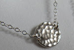
1) From the Following, choose what you think would look best as my new logo, on my business cards etc. (a) The sleek silhouette of an aardvark with some kind of jewelry and title (b) Some close-ups of pieces and title (c) Just Text with a pretty background (d) Other (if you choose this, please give me an idea)
2) Click on the comments section, located just under these rules on the right side titled 'comment' and tell me which you like & Why. Be sure to leave your email address in the comments so i can contact you.
TIME FRAME: This super special and important contest will run from Wednesday Nov. 5 through Wendnesday Nov. 12 giving you plenty of time! I will choose a winner randomly on Nov. 13 and post it on the blog. I will also send a personal email to the winner as!! Winner must respond by Nov. 15, otherwise I will choose another winner.
Good luck, have fun and as always thank you so much for taking the time to read the blog :) xoxo
Sarah @ www.artwark.com
Wednesday, November 5, 2008
Subscribe to:
Post Comments (Atom)
Who/ what the heck is Artwark?
- Jewelry By Artwark (all works COPYRIGHT)
- Artwark is an up and coming jewelry business that began as a hobby 2 years ago. I am designer/marketer, Sarah and i welcome you to my little corner of the world :D


20 comments:
i like the idea of photos so people can see some of the great pieces. maybe the best sellers can go on there.
analisa@yahoo.com
It would be ideal for your logo to show your identity/brand and stand out from other jewelry makers. I voted "other." Here are my ideas:
- Create a circular logo that shows how jewelry connects/links together
- Have a nature/organic theme (goes well with the type of jewelry you make)
- Use a token trinket (ex. acorn, tree, etc.) to represent your brand
The company name should be incorporated and I agree to stray from the cartoon feel.
I like choice C, which is text only. I think you should find a very stylized typeface that speaks to the feel of your designs. I like logos that are clean and straightforward while still being beautifully designed. I agree with you and the others that you have grown out of the cartoon icon.
ebaylogh@gmail.com
I think choice b is the best. As a customer myself, im a very "visual" person & i like to see what the seller is selling as that we draw me into the seller's shop to check out the rest of her creations. Maybe you can place the pieces that you feel are the most eye catching on it?
Thanks for the chance! I hope you'll manage to choose the choice that best suits your needs!
dancerinthemaking@gmail.com
After much thought, i think that your shop's pretty classy so i'll go with choice a! It'll match with your shop's theme i think..Thanks for the cool contest...
Crystal (manhattandolls@gmail.com)
(c) Just Text with a pretty background!
I think that it's straightforward & gives an overall stylish look. Not too advisable to have so many things going on as it'll distract people!
Thanks & hope that helps!
tan.huishan@gmail.com
I am not a particular fan of the creature on the side, but something simple with a creative, poppy touch would nice. I say "other"...keep your options open!
jpylan2@lsu.edu
My favorite thing about Artwark is your mission statement--it discusses the importance of women feeling beautiful yet also empowered by your work in the sense that beauty doesn't come just from the art work we wear, but from inside--something which all women already possess.
So you should stay true to those sentiments when rebranding your logo and maintain the aardvark in silhouette because it explains your name and brings the whole thing full circle. (kristen.heffern@gmail.com)
I like the idea of having close ups of some of your jewelry with the title. Kind of like at the very end of your web page, with the piece that says Oui. That is very eye catching.
kellykostas@live.com
I think you should choose (c) - with a sleek and classy logo and then a pretty background that could incorporate your circular motif and perhaps some of the lovely colors in your jewelry. You can always have a separate stylish pic section below the heading area featuring some of your favorite pieces - or even down one side of the page.
Love your work - keep it up!
bethsta101@hotmail.com
I like the idea of a classy text but rather than just a background, maybe have a "slideshow" effect of some of your jewlery (at least on the website!)
amygualtieri@comcast.net
I think the best option for your logo was the one including the aardvark. It's such an original mascot and I think it would would be the perfect logo for your unique jewelry. The silhouette of it is a great way to make it classy and refined.
Therefore, the aardvark IS the ideal logo for your brand, and it will make you stand out.
aredondo1987@yahoo.com
I like the first idea best. I think that keeping the outline or silhouette of the aardvark ties the new logo in to the previous one, while the pictures of jewelry still highlight your work. That way you get the best of both options, and could change it to highlight different pieces throughout the year.
Samantha (smstarrett@gmail.com)
I like the idea of B. I would be enticed by a simple, attractive "teaser" of your wares. I find simple is almost always best :).
pascallebytheseaside@hotmail.com
When i first saw your logo i had no problem with it but i didn't understand it. I now understand the logo but i really don't think it sheds any light onto the beautiful pieces and style of jewelry you make. You have a very earthy vintage and petite style. Your logo should represent that. Birds, tree's, flowers, some sort of petite border of vine's maybe, with a floral touch and sparrow??? The text should should stand out but still show your soft side. I used to be a graphic designer! haha i could go on all day! You could always keep it original with the aardvark but i think your looking change or you wouldn't have asked :) My choice is obviously; other.
I like the idea of keeping the aardvark, but maybe updating it to keep up with your evolving image. Having the aardvark does help to explain the name and also goes back to the beginning of your work. Your pieces are beautiful and eye-catching, I'm looking forward to seeing the new logo!
stephanie.juice@gmail.com
I say option A - it's simple and classy! Just like your jewelry!
I'll say A~ Keeping it simple can never be wrong. Plus it'll look great too!
Cheers,
Melody
mel_88_88@hotmail.com
Im late but just wanted to let you know my opinion.. haha!
Cheers,
Melody
mel_88_88@hotmail.com
Post a Comment